Lab 07: Intro to ggplot2
Graphics with Base R?
So far we’ve produced graphics with base R, which you likely felt unintuitive and inflexible.
The package dplyr made data manipulation easier and more flexible.
Now we introduce the package ggplot2, which will provide these benefits for data visualization.
Introducing ggplot2
ggplot2 provides us with a set of functions to intuitively and quickly produce attractive plots.
The package ggplot2…
- provides us with a grammar of data visualization.
- is based on the idea of decomposing plots into various distinct components – and later layers.
- is the most widely used graphics library for R.
- has countless extensions (e.g., for animations, rare plot types).
Introducing ggplot2
- is designed on the idea of decomposing plots into various distinct components – and later layers.
A good grammar will allow us to gain insight into the composition of complicated graphics, and reveal unexpected connections between seemingly different graphics.1 – Hadley Wickham
Components?
Ask yourself, what makes up a plot?
Data and Aesthetic Mapping
What data is the plot using and communicating? How is it mapped (e.g., what data is used for each axis)?
Geometric Objects
How are we representing the data geometrically? Lines, points, colored area?
Scales, Coordinate Systems
How large/small are the objects? What coordinate systems do we use? Units?
Components in ggplot2
… And more. But we’ll get started with these.
At a high level, we create components with function calls, and connect them to form a cohesive whole.
The Data and Aesthetic Mapping Component
The first component you’ll need is one that defines…
- what data you’ll be using –
data. - how the data is mapped aesthetically –
mapping.
The Data and Aesthetic Mapping Component
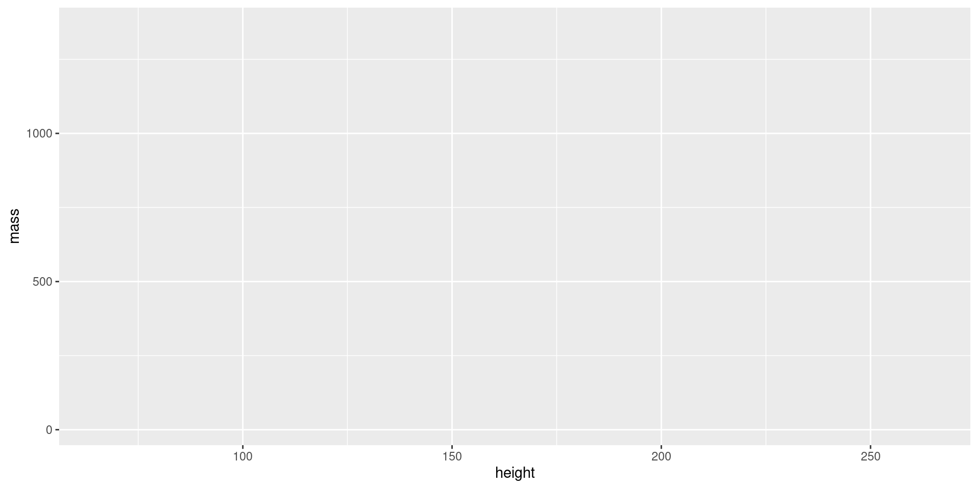
What we have so far…
The Geom Component
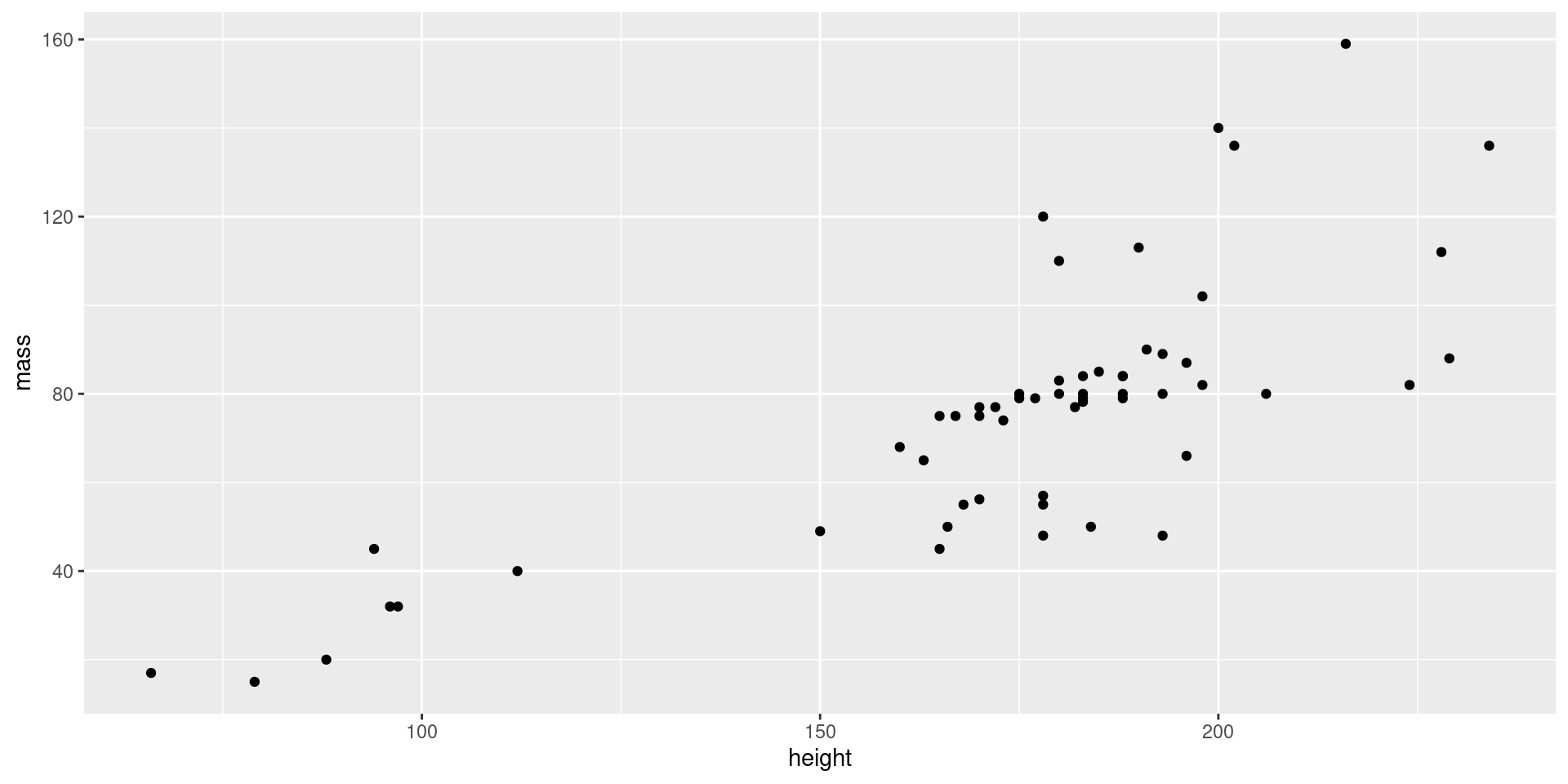
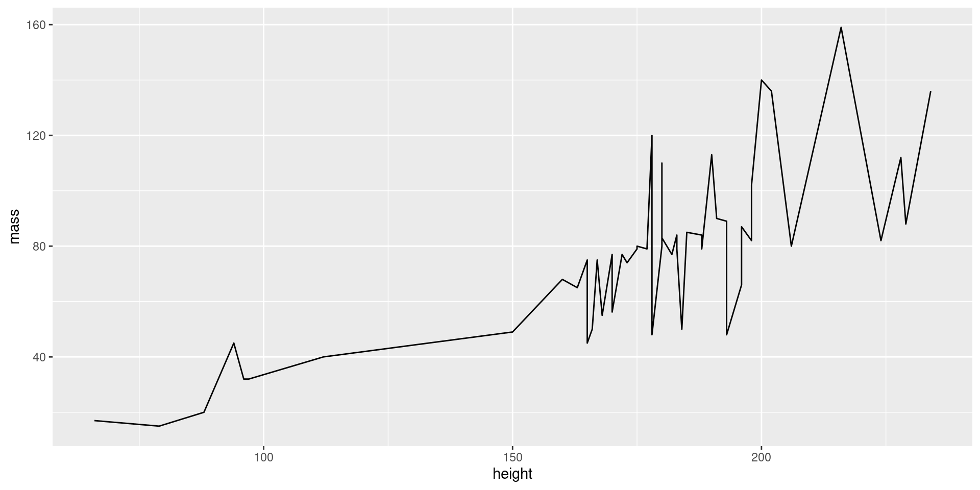
Our plot is empty! We need to define the geom, i.e., what geometrical objects will be used to represent the data.
These components are created with geom_* functions.
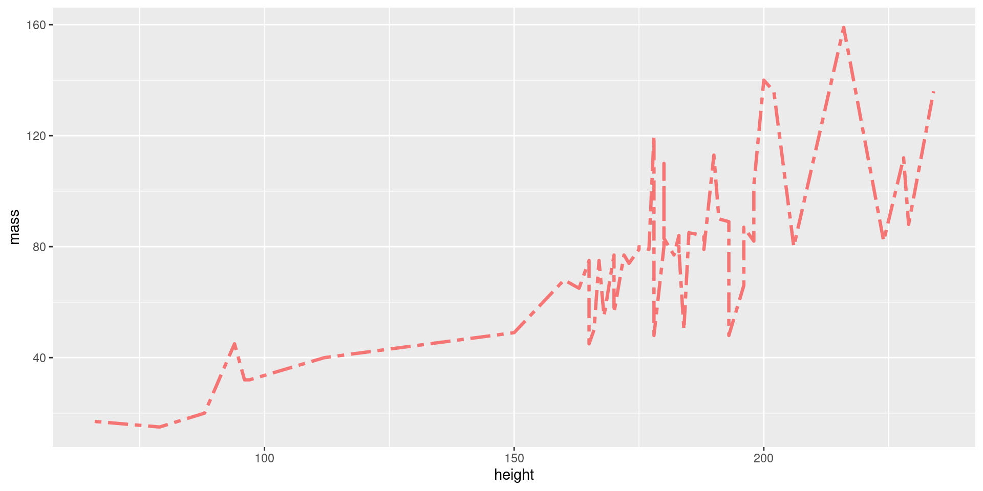
Customizing Geoms
Each geom has many options for customization. Enter ?<function> to learn more about your geom of interest.
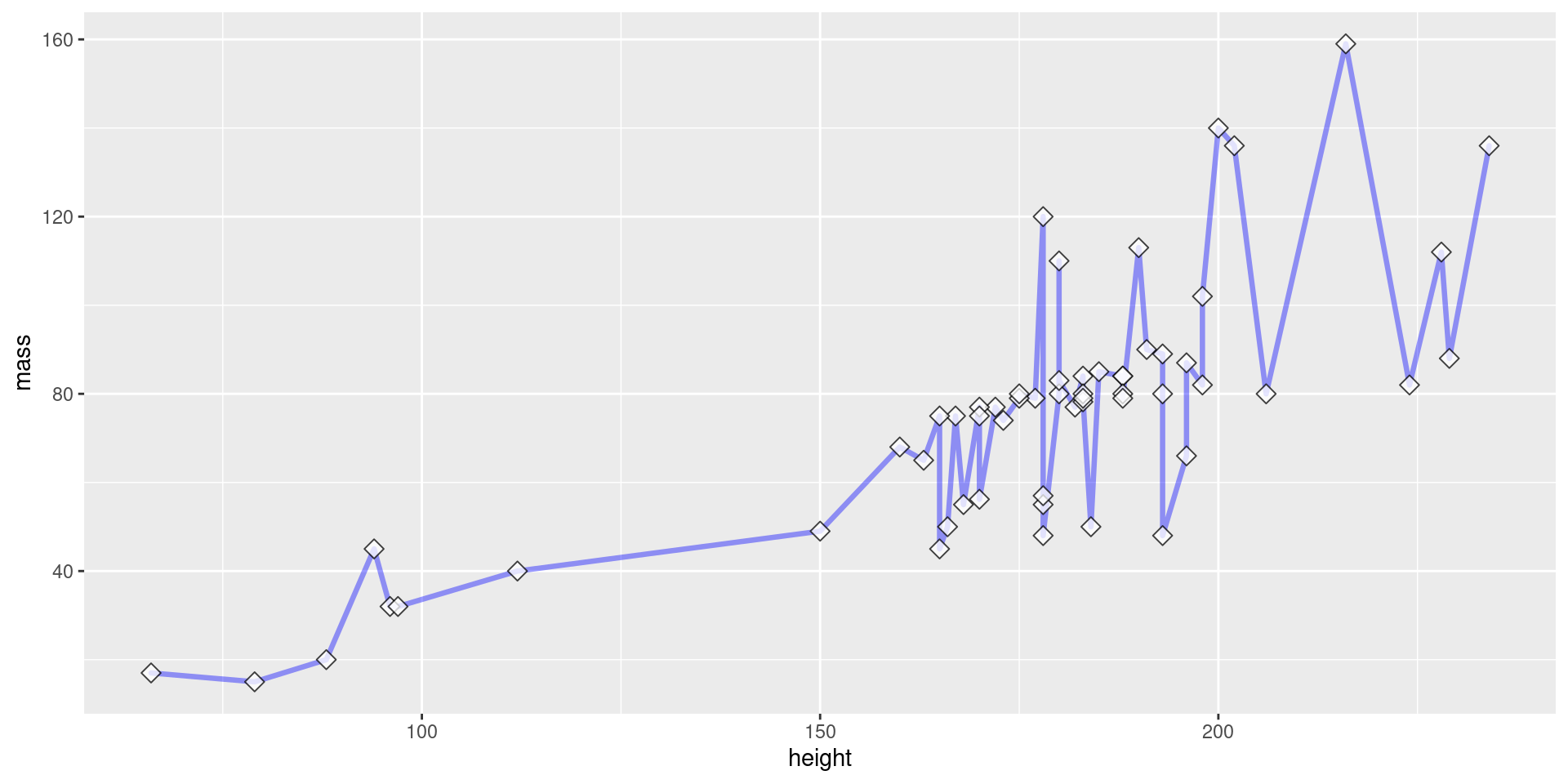
Layering Geoms
View Plot Code
starwars |>
  filter(mass < 200) |>
  ggplot(aes(x = height, y = mass)) +
    geom_line(
      color = "blue",     # define line color
      alpha = 0.4,        # define line opacity
      size = 1.15,        # define line thickness
      lineend = "round",  # define how lines end
      linejoin = "round"  # define how lines connect
    ) +
    geom_point(
      color = "black",    # define shape border color
      fill = "white",     # define shape fill color
      alpha = 0.75,       # define shape opacity
      shape = 23,         # define shape type (square, circle, etc.)
      size = 3,            # define shape size (how big?)
    )
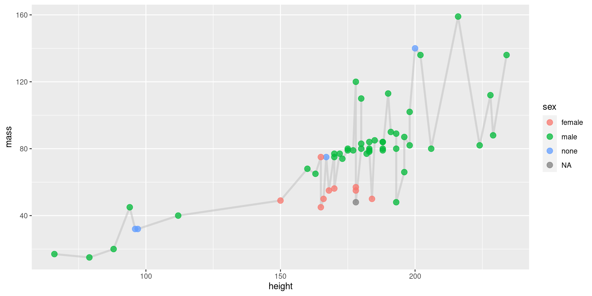
Geoms, Coloring by Group
View Plot Code
starwars |>
  filter(mass < 200) |>
  ggplot(aes(x = height, y = mass)) +
    geom_line(
      color = "grey",     # define line color
      alpha = 0.5,        # define line opacity
      size = 1.15,        # define line thickness
      lineend = "round",  # define how lines end
      linejoin = "round"  # define how lines connect
    ) +
    geom_point(
      aes(fill = sex, color = sex),  # define what determines fill, color
      alpha = 0.75,       # define shape opacity
      shape = 21,         # define shape type (square, circle, etc.)
      size = 3,           # define shape size (how big?)
    )
Geoms, Endless Customization!
There are many more geoms, and many, many more customization options. Don’t expect to memorize them.
Become comfortable reading the documentation.
Use ?<function>.
Don’t You Dare Label Me!
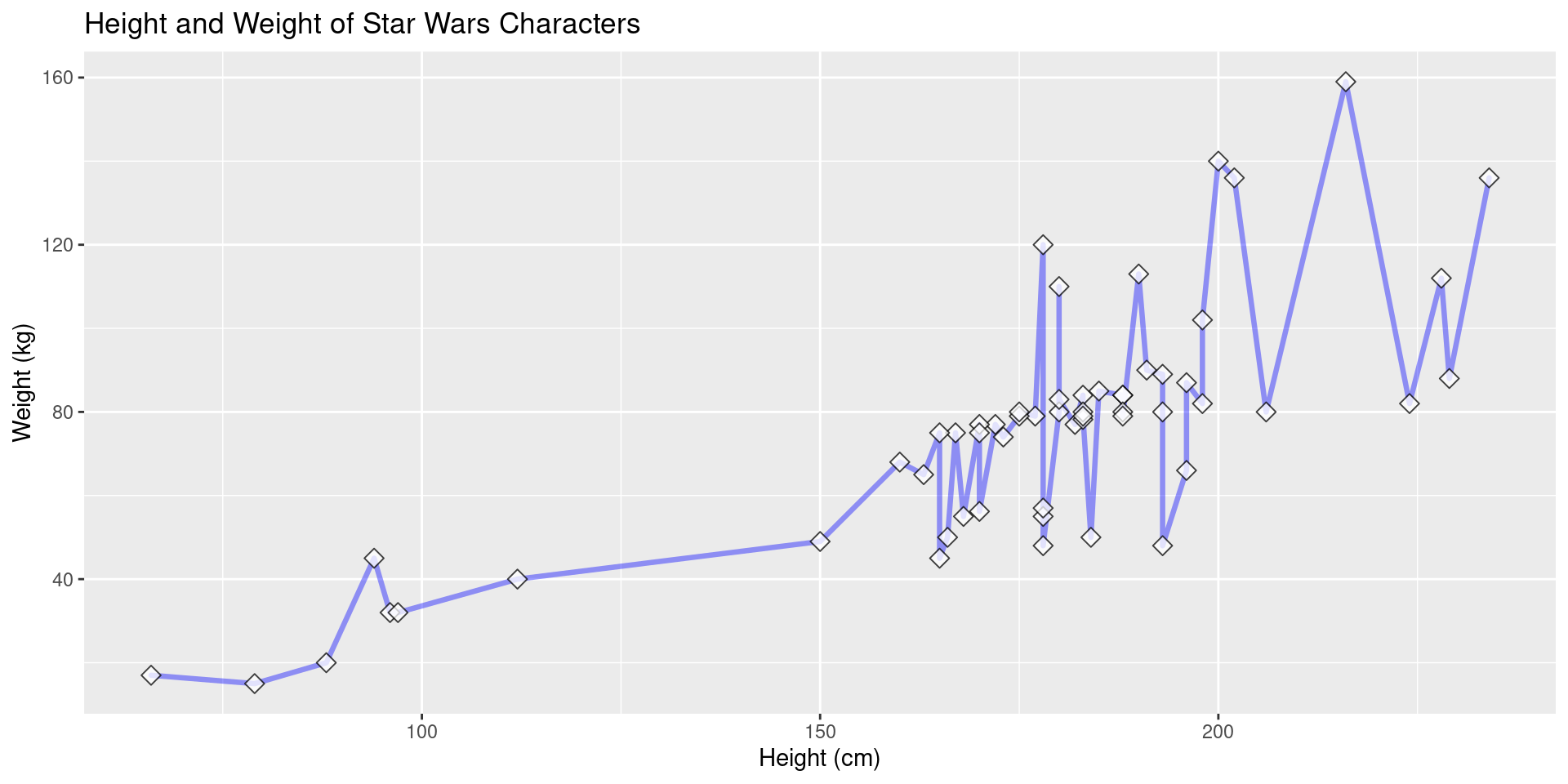
Our plots look unprofessional now because we’ve not added proper labels.
Label Example
Here we add a title and proper axis titles.
View Plot Code
starwars |>
  filter(mass < 200) |>
  ggplot(aes(x = height, y = mass)) +
    geom_line(
      color = "blue",     # define line color
      alpha = 0.4,        # define line opacity
      size = 1.15,        # define line thickness
      lineend = "round",  # define how lines end
      linejoin = "round"  # define how lines connect
    ) +
    geom_point(
      color = "black",    # define shape border color
      fill = "white",     # define shape fill color
      alpha = 0.75,       # define shape opacity
      shape = 23,         # define shape type (square, circle, etc.)
      size = 3,           # define shape size (how big?)
    ) +
    labs(
      title = "Height and Weight of Star Wars Characters",
      x = "Height (cm)",
      y = "Weight (kg)"
    )
Still Unsatisfied? Use Themes!
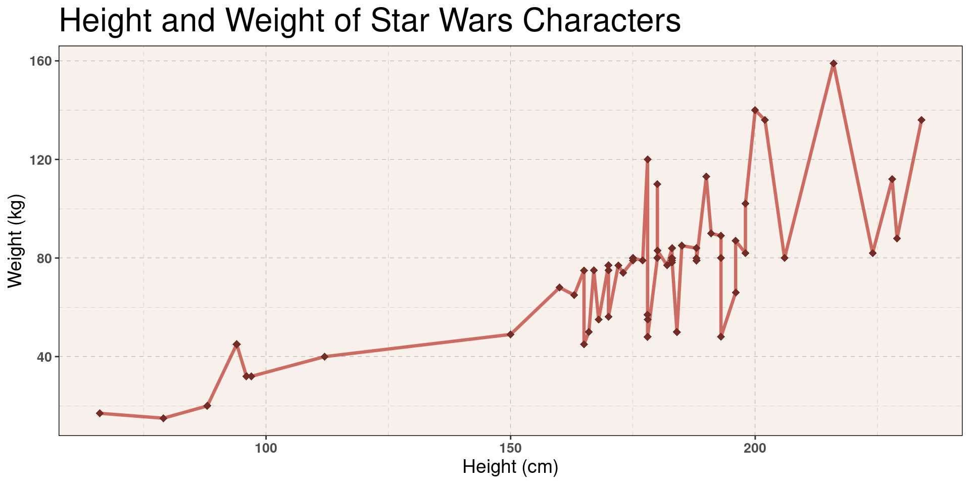
If the visuals of these plots don’t satisfy you, we can go further and customize every detail by creating a custom theme component.
Well That’s Out of Scope…
This is out of scope for this class, but I’ll share an example to peek your interest. Feel free to ask me during lab/OH if you’d like to learn more.
Theme Example, Creation
An example theme (from one of my STAT 133 projects).
off_white <- "#F7F0EB"
example_theme <- theme(
  plot.title = element_text(size = 24),
  plot.subtitle = element_text(size = 14, face = "italic"),
  axis.title = element_text(size = 14),
  axis.text = element_text(size = 10, face = "bold"),
  panel.background = element_rect(fill = off_white, color = "black"),
  panel.grid = element_line(linetype = 2, size = 0.05, color = "black")
)
Theme Example, Plot
Show Plot Code
# We label these colors for clarity.
red <- "#C24A40"
dark_red <- "#732C26"

starwars |>
  filter(mass < 200) |>
  ggplot(aes(x = height, y = mass)) +
    geom_line(
      color = red,
      alpha = 0.8,
      size = 1.15,
      lineend = "round",
      linejoin = "round"
    ) +
    geom_point(
      color = dark_red,
      alpha = 1,
      shape = 18,
      size = 2.5,
    ) +
    labs(
      title = "Height and Weight of Star Wars Characters",
      x = "Height (cm)",
      y = "Weight (kg)"
    ) +
    example_theme  # We add the theme here