Lab 03: Intro to dplyr and ggplot2
Packages
To get you productive quickly, we’ll start at a high level with two popular packages:
dplyr: Allows us to easily manipulate data frames.ggplot2: Allows us to easily create attractive plots.
At a glance, a package is simply a collection of code somebody has written for us.
Note: Downloading Packages
To download a package <package>, run,
install.packages("<package>")To load and attach (i.e., to use) a package, run,
library(<package>)Note that the former line requires a string, while the second requires a variable.
Data Frames
Data frames are an important data structure in R. For now1, simply consider a data frame to be,
- a two-dimensional data structure (similar to a table).
| A | B | C |
|---|---|---|
| 1 | 2 | 3 |
| 4 | 5 | 6 |
| 7 | 8 | 9 |
Importantly, we have columns (data types) and rows (entries).
Operations on Data Frames
Consider some of operations you’d ordinarily make on tables:
- Filtering: Give me the entries for which something is true.
- Slicing: Give me a subset of the entries (e.g., the first 10).
- Selecting: Give me a subset of the columns.
Each of these correspond to a similarly named dplyr function.
dplyr’s Verbs
We say that dplyr provides us with a set of verbs to manipulate data frames. We’ll go over a few of them today:
sliceselectfiltermutatesummarise
slice
Suppose we want some subset of the rows. In base R1,
Note that slice works only with indices. Unlike base R subsetting, you can’t use strings or logical values.
select
Suppose we want to select some of the columns. In base R,
filter
Suppose we want to filter the rows by some condition. In base R,
dplyr provides us with the filter function.
mutate
Suppose we want to add new columns. In base R,
dplyr provides us with the function mutate.
Wait, did that change starwars?
No, it returned a new, mutated data frame. To modify, we must reassign.
summarise/summarize
We can use summarise to obtain summary statistics on the data frame (in the form of a new data frame).
summarise(
    starwars,  # what we are summarising
    avg_height = mean(height, na.rm = TRUE),
    avg_mass = mean(mass, na.rm = TRUE),
    avg_birth_year = mean(birth_year, na.rm = TRUE)
)
# A tibble: 1 × 3
avg_height avg_mass avg_birth_year
<dbl> <dbl> <dbl>
1 174. 97.3 87.6But what if we wanted to get these values for each group (say, each species)?
Would we have to filter the data frame three times, then call summarise for each?
group_by
We can use group_by to form a new table which is grouped by the values in particular columns. The functions you use will be applied to the groups separately, after which dplyr groups the results.
summarise(
    group_by(starwars, sex),
    avg_height = mean(height, na.rm = TRUE),
    avg_mass = mean(mass, na.rm = TRUE),
    avg_birth_year = mean(birth_year, na.rm = TRUE)
)
# A tibble: 5 × 4
sex avg_height avg_mass avg_birth_year
<chr> <dbl> <dbl> <dbl>
1 female 169. 54.7 47.2
2 hermaphroditic 175 1358 600
3 male 179. 81.0 85.5
4 none 131. 69.8 53.3
5 <NA> 181. 48 62 Much More
I’ve only introduced the most basic functionality of these functions.
Enter ?<function> to explore additional functionality.
An Aside: Piping
Piping will be explored in greater detail later.
Suppose we have this code:
In what order are the functions f(), g(), and h() called?
h(), then g(), then f()! We’ve written it backwards?
An Aside: Piping
To make nested functions easier to read and write, we use the pipe operator.
a() %>% b() becomes b(a()).
That is, the left operand is passed as the first argument to the second operand.
An Aside: Piping
The %>% symbol comes from the package magrittr.
If you’re using a new version of R (>4.1.0), I’d recommend using the new pipe operator built into R, |>.
Piping in Action
A more elaborate example from the Algorithmic Problems page:
qaq <- function(string) {
  # Obtain the individual characters in `string`.
  characters <- strsplit(string, "")[[1]]

  # Form a prefix vector for the number of "Q"s at each index.
  q_count <- characters |>
    equals("Q") |>
    as.numeric() |>
    accumulate(`+`)

  # For each "A" we can form <"Q"s before "A"> * <"Q"s after "A"> "QAQ"s. We
  # obtain this value for each "A" and sum them.
  characters |>
    equals("A") |>
    multiply_by(q_count) |>
    multiply_by(tail(q_count, 1) - q_count) |>
    sum()
}
Graphics with Base R?
So far we’ve produced graphics with base R, which you likely felt unintuitive and inflexible.
The package dplyr made data manipulation easier and more flexible.
Now we introduce the package ggplot2, which will provide these benefits for data visualization.
Introducing ggplot2
ggplot2 provides us with a set of functions to intuitively and quickly produce attractive plots.
The package ggplot2…
- provides us with a grammar of data visualization.
- is based on the idea of decomposing plots into various distinct components – and later layers.
- is the most widely used graphics library for R.
- has countless extensions (e.g., for animations, rare plot types).
Introducing ggplot2
- is designed on the idea of decomposing plots into various distinct components – and later layers.
A good grammar will allow us to gain insight into the composition of complicated graphics, and reveal unexpected connections between seemingly different graphics.1 – Hadley Wickham
Components?
Ask yourself, what makes up a plot?
Data and Aesthetic Mapping
What data is the plot using and communicating? How is it mapped (e.g., what data is used for each axis)?
Geometric Objects
How are we representing the data geometrically? Lines, points, colored area?
Scales, Coordinate Systems
How large/small are the objects? What coordinate systems do we use? Units?
Components in ggplot2
… And more. But we’ll get started with these.
At a high level, we create components with function calls, and connect them to form a cohesive whole.
The Data and Aesthetic Mapping Component
The first component you’ll need is one that defines…
- what data you’ll be using –
data. - how the data is mapped aesthetically –
mapping.
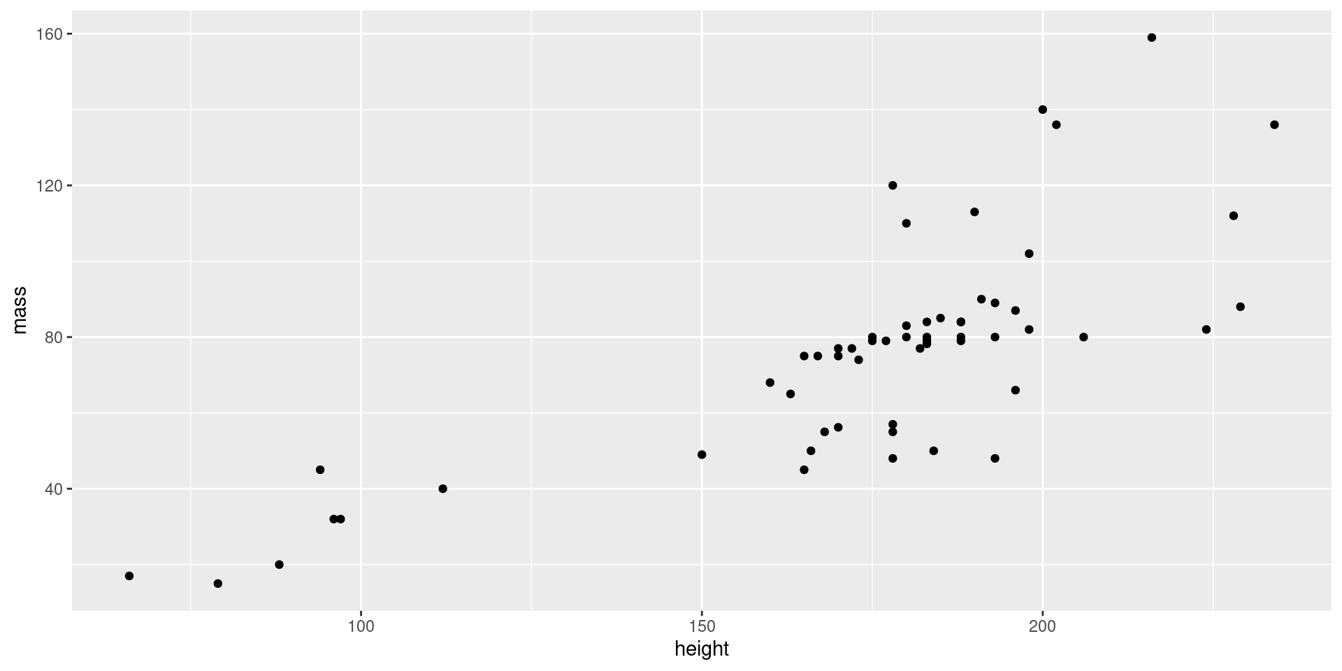
The Data and Aesthetic Mapping Component
What we have so far…
The Geom Component
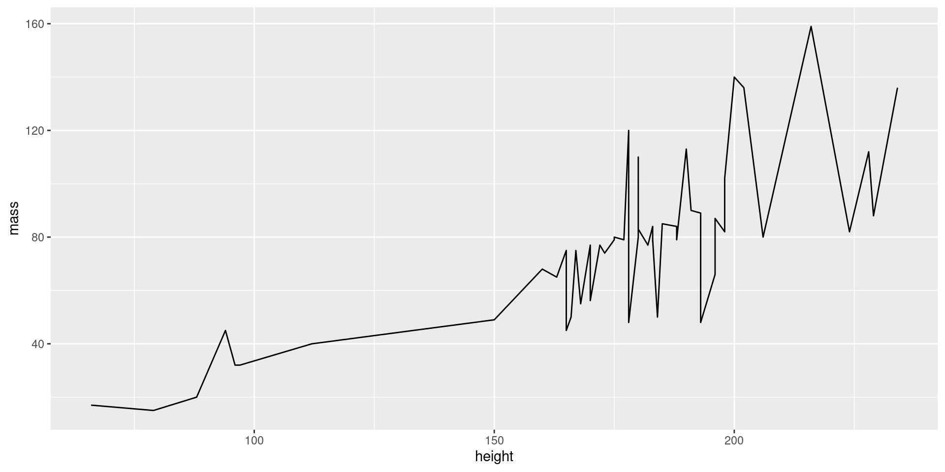
Our plot is empty! We need to define the geom, i.e., what geometrical objects will be used to represent the data.
These components are created with geom_* functions.
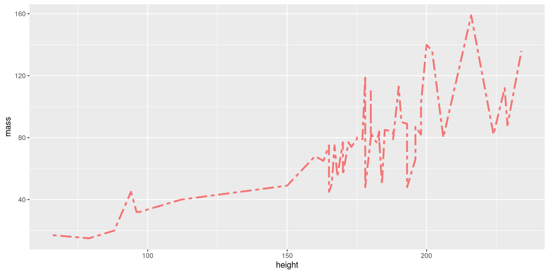
Customizing Geoms
Each geom has many options for customization. Enter ?<function> to learn more about your geom of interest.
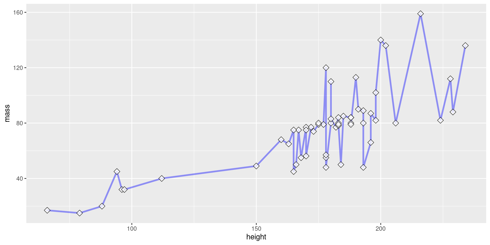
Layering Geoms
View Plot Code
starwars |>
  filter(mass < 200) |>
  ggplot(aes(x = height, y = mass)) +
    geom_line(
      color = "blue",     # define line color
      alpha = 0.4,        # define line opacity
      size = 1.15,        # define line thickness
      lineend = "round",  # define how lines end
      linejoin = "round"  # define how lines connect
    ) +
    geom_point(
      color = "black",    # define shape border color
      fill = "white",     # define shape fill color
      alpha = 0.75,       # define shape opacity
      shape = 23,         # define shape type (square, circle, etc.)
      size = 3,            # define shape size (how big?)
    )
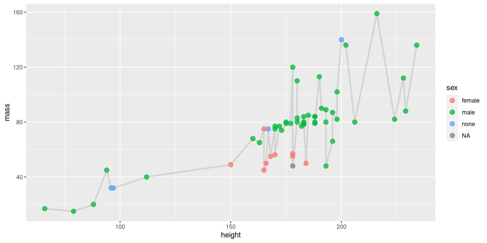
Geoms, Coloring by Group
View Plot Code
starwars |>
  filter(mass < 200) |>
  ggplot(aes(x = height, y = mass)) +
    geom_line(
      color = "grey",     # define line color
      alpha = 0.5,        # define line opacity
      size = 1.15,        # define line thickness
      lineend = "round",  # define how lines end
      linejoin = "round"  # define how lines connect
    ) +
    geom_point(
      aes(fill = sex, color = sex),  # define what determines fill, color
      alpha = 0.75,       # define shape opacity
      shape = 21,         # define shape type (square, circle, etc.)
      size = 3,           # define shape size (how big?)
    )
Geoms, Endless Customization!
There are many more geoms, and many, many more customization options. Don’t expect to memorize them.
Become comfortable reading the documentation.
Use ?<function>.
Don’t You Dare Label Me!
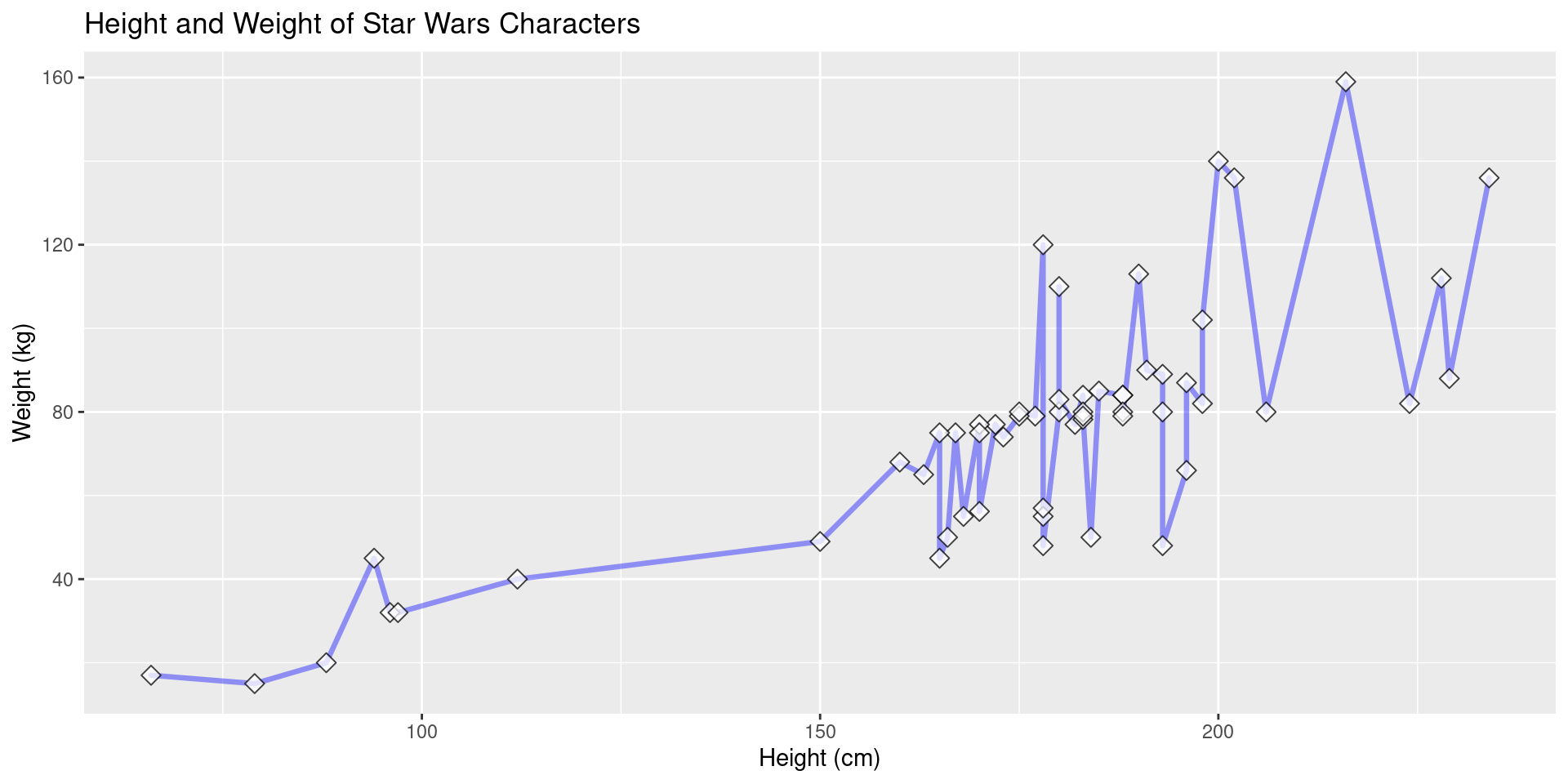
Our plots look unprofessional now because we’ve not added proper labels.
Label Example
Here we add a title and proper axis titles.
View Plot Code
starwars |>
  filter(mass < 200) |>
  ggplot(aes(x = height, y = mass)) +
    geom_line(
      color = "blue",     # define line color
      alpha = 0.4,        # define line opacity
      size = 1.15,        # define line thickness
      lineend = "round",  # define how lines end
      linejoin = "round"  # define how lines connect
    ) +
    geom_point(
      color = "black",    # define shape border color
      fill = "white",     # define shape fill color
      alpha = 0.75,       # define shape opacity
      shape = 23,         # define shape type (square, circle, etc.)
      size = 3,           # define shape size (how big?)
    ) +
    labs(
      title = "Height and Weight of Star Wars Characters",
      x = "Height (cm)",
      y = "Weight (kg)"
    )
Still Unsatisfied? Use Themes!
If the visuals of these plots don’t satisfy you, we can go further and customize every detail by creating a custom theme component.
Well That’s Out of Scope…
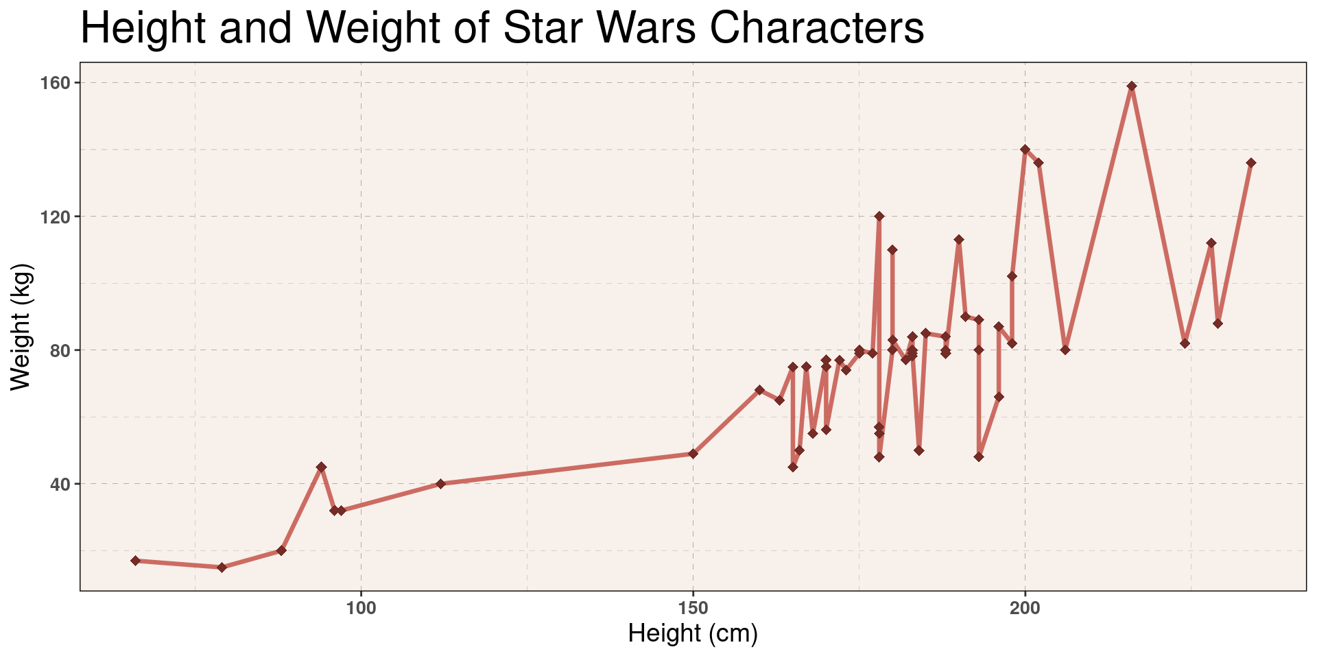
This is out of scope for this class, but I’ll share an example to peek your interest. Feel free to ask me during lab/OH if you’d like to learn more.
Theme Example, Creation
An example theme (from one of my STAT 133 projects).
off_white <- "#F7F0EB"
example_theme <- theme(
  plot.title = element_text(size = 24),
  plot.subtitle = element_text(size = 14, face = "italic"),
  axis.title = element_text(size = 14),
  axis.text = element_text(size = 10, face = "bold"),
  panel.background = element_rect(fill = off_white, color = "black"),
  panel.grid = element_line(linetype = 2, size = 0.05, color = "black")
)
Theme Example, Plot
Show Plot Code
# We label these colors for clarity.
red <- "#C24A40"
dark_red <- "#732C26"

starwars |>
  filter(mass < 200) |>
  ggplot(aes(x = height, y = mass)) +
    geom_line(
      color = red,
      alpha = 0.8,
      size = 1.15,
      lineend = "round",
      linejoin = "round"
    ) +
    geom_point(
      color = dark_red,
      alpha = 1,
      shape = 18,
      size = 2.5,
    ) +
    labs(
      title = "Height and Weight of Star Wars Characters",
      x = "Height (cm)",
      y = "Weight (kg)"
    ) +
    example_theme  # We add the theme here